Colourful wedding photography
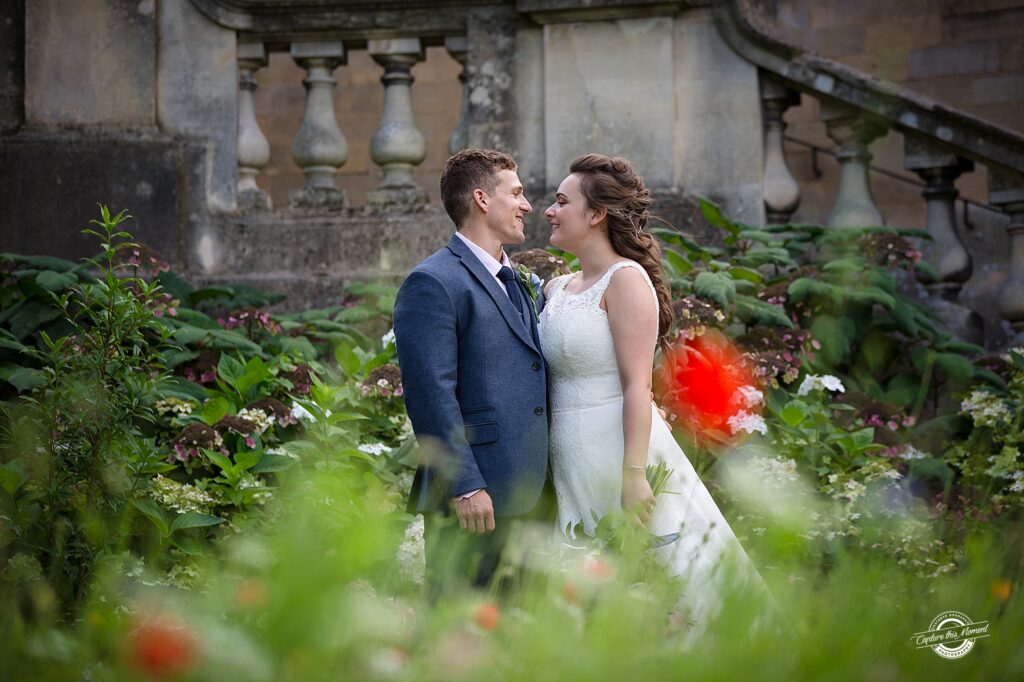
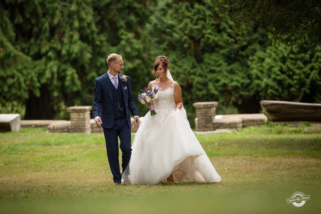
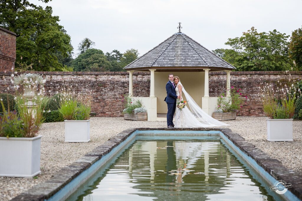
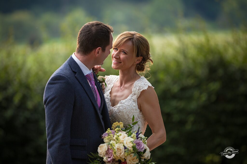
Do you love colour? I capture colourful, natural wedding photographs.
I get excited when I find a colourful doorway, lush greens in a garden, vibrant oranges at sunset.
Don’t hide colour – I celebrate them!
My photography is described as colourful and natural.
Colour provide indicators of times of the year, lush greens and autumnal tones but in wedding photography and perhaps in all photography colour creates a mood.
Colour catches the eye. It helps to set the style and theme for your whole day, as well as helping you choose elements such as flowers, bridesmaid dresses, the wedding cake and stationary.
Choosing the perfect colours for your day
Think about…..
Location
If you’ve already got your eye on a venue that already has a certain style, think about the colours so that highlight and compliment the best features of your venue.


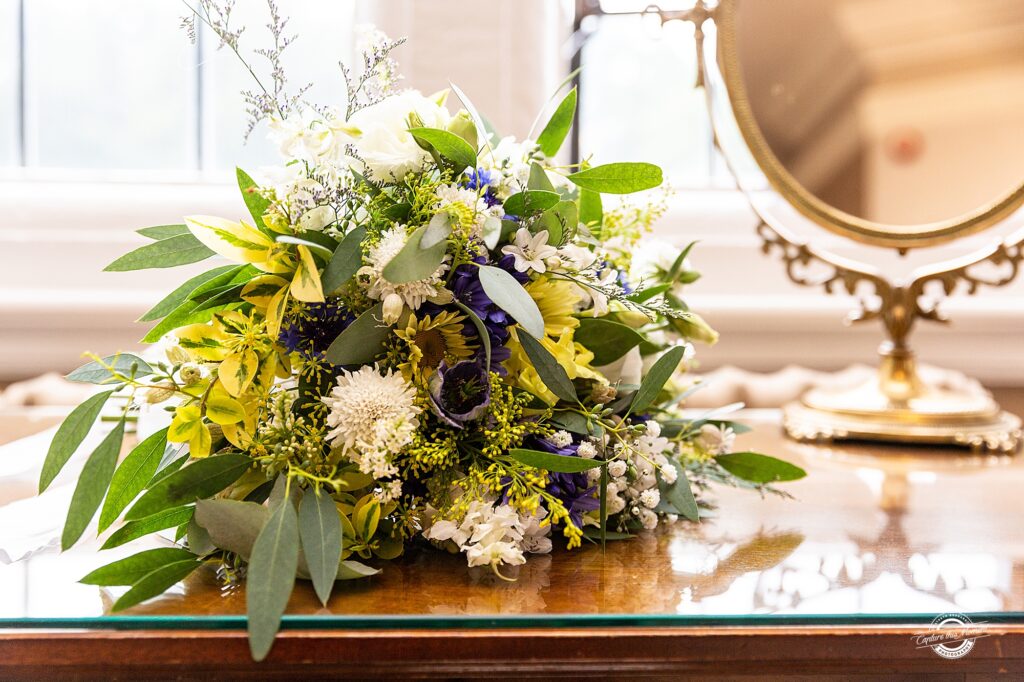
The Small Details
Finding a venue can be the cornerstone moment of wedding planning for some couples, for others, their favourite flowers, the wedding dress or the ultimate bridesmaid attire can be the deciding factors in choosing a colour scheme. So if you have certain must-haves, without which you can’t imagine your wedding, get those scribbled down.
Season
Draw inspiration from your chosen wedding season. Pastels can work well for winter, jewel tones will look fantastic in autumn, so feel free to experiment with textures and different shades!

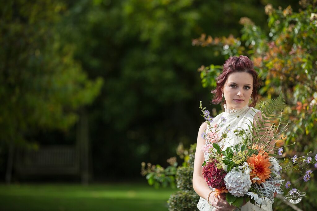
The Mood
What kind of wedding do you want? If you’re after a feeling of luxury and drama, then go for darker and richer colours. If you are a fan of a romantic atmosphere, lighter shades will look perfect.
Your favourites
Look in your home and wardrobe for colour inspiration. The colours that dominate there are obviously the ones you love. Bonus: the wedding photos that will take their place on the mantelpiece will even match your home – now that’s planning!

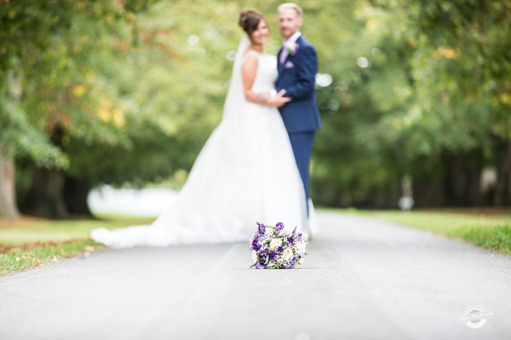
Research
Keep your options open and look around before settling on a palette. Hit Pinterest or Instagram for inspiration.
Colour wheels
Grab a colour wheel. The basic rules for colours are that cool and warm colours go well together, as do colours which have the same primary colour base.
Within that, you can pick an analogous colour scheme, with three colours located next to each other on the colour wheel, or you can choose complementary colours, which sit directly opposite each other on a colour wheel. Alternatively, you can go for monochromatic colours, which are a number of different shades taken from the same hue.
Our general rule for choosing wedding colours is to have at least one neutral colour which your guests’ eyes can rest on to balance the bright colours in your palette. And there you go!

Pantone
Every year, Pantone releases its “Colours Of The Year”, a list that attempts to predict the colours that will be everywhere in the coming year. The irony is that this list often decides what the predominant colours will be the next year, and thus what’s readily available from suppliers and shops.
Bridesmaids and Groomsmen
Needless to say, when choosing wedding colours, choose shades that are easily wearable, especially if you want the bridesmaids to carry the majority of colour – and talk to you again!
I love to use colour, it is a main element in my photographs. The beautiful colours of a wedding dress, the bouquet, table decorations and (fingers crossed) some warm evening light. Back at my computer I love to work on developing and enhancing the colours from your wedding day
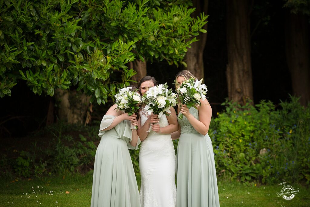
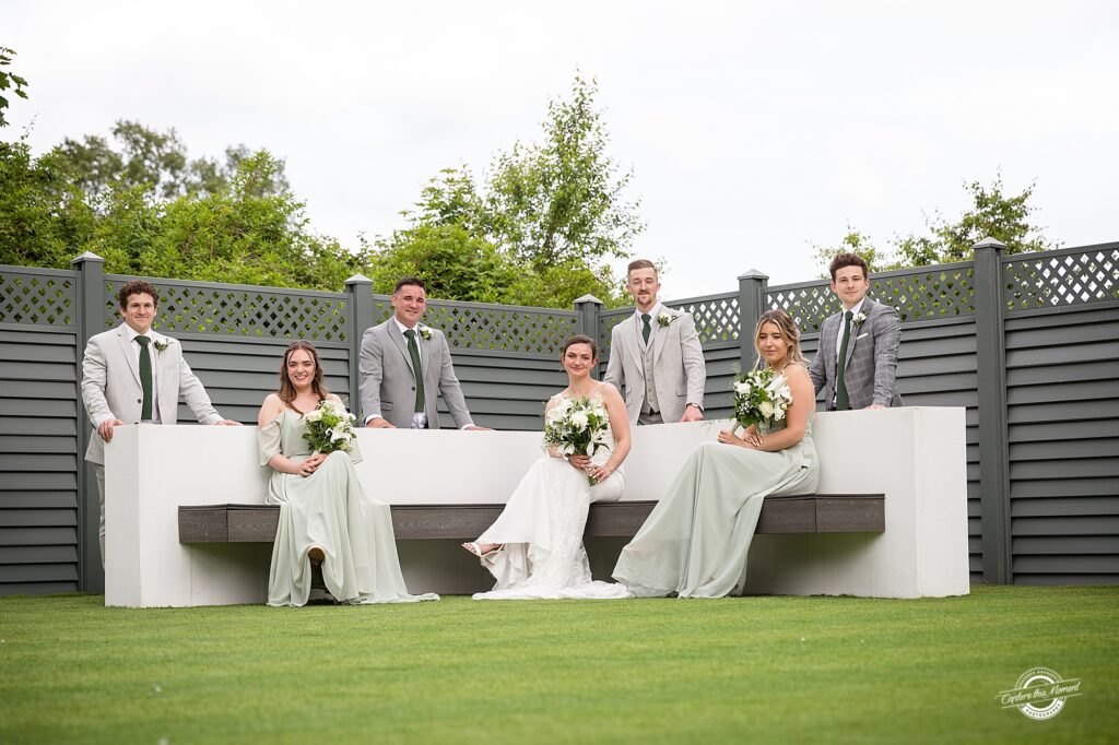
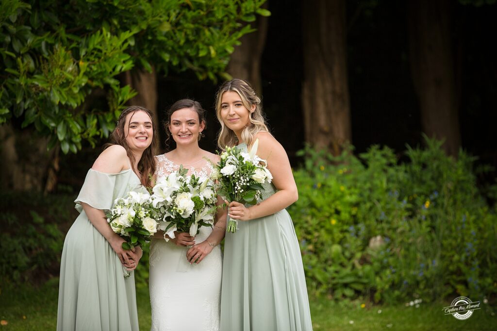
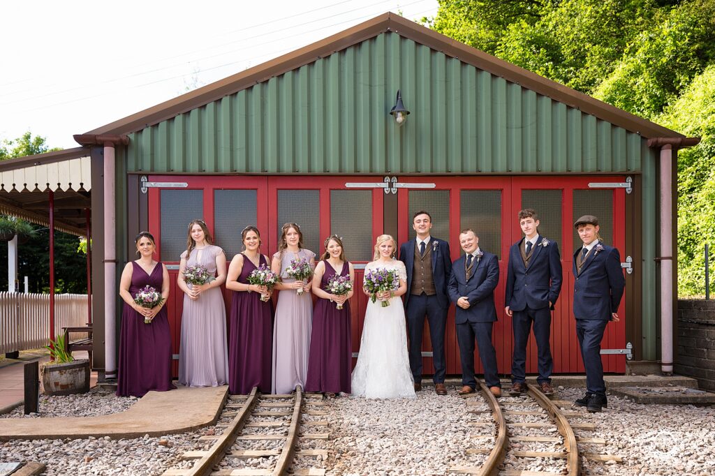
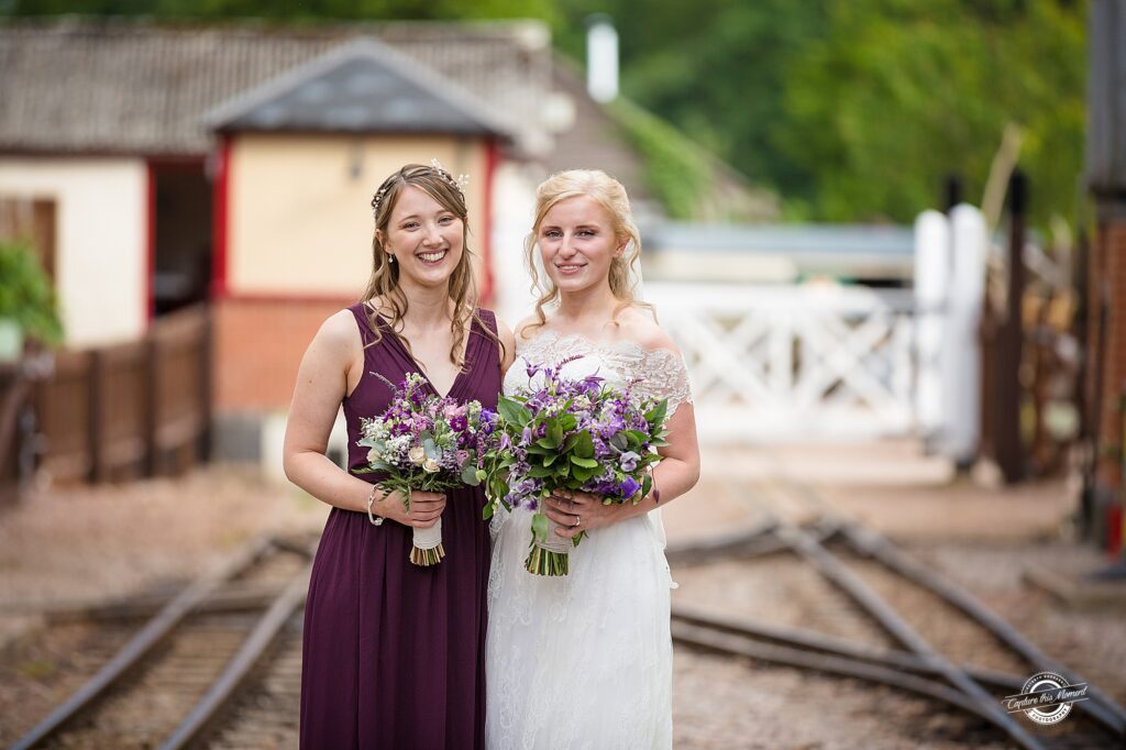

From delicate pastels, lush greens and vibrant purples – let’s celebrate the colours of your wedding day.
Do you want colourful, natural photos of your wedding? Why not, contact me and see if I am perfect wedding photographer for your day.
Leave a Reply Cancel reply
Thank you!
Your message has been sent. We'll contact you shortly
©kathryn goddard Photography|2026 Gloucestershire branding, family and wedding photographer
Privacy policy
Terms & Conditions